
Color is one of the most important decisions in epoxy flooring.
The right color can make your space feel bright and clean. The wrong color can look dated or mismatched with your design.
With 50+ color options available, how do you choose?
This guide walks you through the color selection process—from understanding color psychology to visualizing colors in your space to making a confident choice you’ll love for 10+ years.
WHY COLOR MATTERS
Before diving into specific colors, understand why this decision is important.
Psychological Impact
Colors affect mood and perception. A dark garage feels industrial. A light garage feels clean and open. Neutral colors feel professional. Bold colors make statements.
Long-Term Commitment
You’ll live with this color for 10-15 years. It should be something you genuinely love, not just a trendy choice.
Design Integration
Your floor should complement your home’s existing design. Colors should coordinate with walls, cabinets, counters, and overall aesthetic.
Resale Value
Neutral colors appeal to broader audiences. Bold colors appeal to specific tastes. Consider future resale when choosing.
Maintenance Visibility
Darker colors hide dust but show water spots. Lighter colors show dirt but hide water marks. Consider practical maintenance.
COLOR FAMILIES
Epoxy comes in multiple color families. Understanding them helps you narrow choices.
Neutrals: Clean, Professional
White: Brightest, showroom-quality, requires frequent cleaning Cream: Warm neutral, hides dust, professional appearance Light Gray: Modern, bright, practical Charcoal Gray: Sophisticated, hides dust, industrial feel Black: Bold, dramatic, professional
Best for: Most applications, matches any style
Blues: Cool, Professional
Light Blue: Clean, bright, airy feeling Sky Blue: Fresh, open, modern Cobalt: Bold, professional, contemporary Navy: Deep, professional, sophisticated Teal: Modern, trendy, unique
Best for: Modern homes, contemporary designs, industrial aesthetics
Earth Tones: Warm, Natural
Tan: Warm, natural, welcoming Beige: Classic, timeless, versatile Bronze: Warm, luxurious, metallic feel Copper: Rich, warm, artistic Rust: Earth-inspired, natural
Best for: Warm interiors, traditional designs, natural aesthetics
Grays: Modern, Versatile
Silver: Sleek, modern, reflective Dove Gray: Soft, contemporary, calming Slate Gray: Professional, sophisticated Graphite: Deep, modern, bold
Best for: Modern homes, contemporary offices, minimalist designs
Bold & Custom: Statement Colors
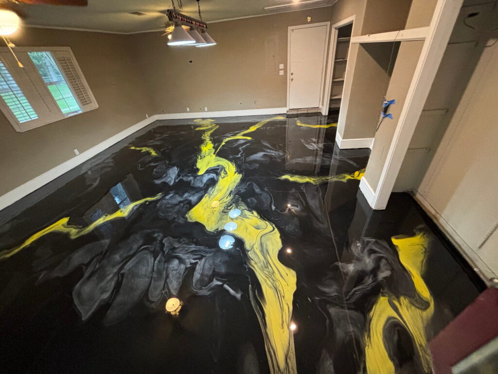
Red: Bold, dramatic, energetic (uncommon but possible) Green: Natural, trendy, unique Yellow: Warm, energetic, distinctive Custom Blends: Any color imaginable
Best for: Homeowners wanting unique statements, creative spaces
COLOR SELECTION PROCESS
How to choose with confidence.
Step 1: Assess Your Lighting
Color looks completely different in different lighting.
Natural light: Shows true color Fluorescent: Makes colors cooler/harsher LED: Depends on color temperature Morning vs. afternoon: Light changes throughout day
Visit your space at different times with color samples.
Step 2: Consider Your Style
What’s your home’s design aesthetic?
Modern: Cool neutrals, grays, metallics Traditional: Warm neutrals, earth tones Industrial: Grays, blacks, polished concrete look Contemporary: Bold colors, metallics, unique finishes Minimalist: Pure whites, clean colors, no patterns
Choose colors that complement your existing design.
Step 3: Consider Practical Factors
Does your space hide dirt or show it?
Kitchens: Darker colors hide spills Garages: Medium colors balance cleanliness and practicality Living spaces: Your preference (lighter or darker)
Does water spotting concern you?
Light colors: Show water spots Dark colors: Hide spots but show marks
Step 4: Test in Your Space
Don’t commit without seeing colors in your actual space.
Process:
- CB1 brings color samples
- View in your lighting
- Compare with your furnishings
- See how light changes the color
- Make informed decision
Step 5: Visualize Long-Term
Will you love this color in 5 years? 10 years?
Trends fade. Choose colors you genuinely love, not trendy colors.
COLOR PSYCHOLOGY IN EPOXY
Colors communicate and influence perception.
Bright Colors (White, Light Gray)
- Psychology: Clean, open, professional
- Best for: Showcasing spaces, professional impression
- Effect: Makes spaces feel larger and brighter
- Caution: Shows dirt and water spots
Neutral Colors (Tan, Beige, Cream)
- Psychology: Warm, welcoming, versatile
- Best for: Traditional homes, any design
- Effect: Matches anything, timeless appeal
- Caution: Can feel boring without variation
Dark Colors (Charcoal, Navy, Black)
- Psychology: Sophisticated, professional, industrial
- Best for: Showing luxury, professional appearance
- Effect: Hides dust and marks, feels sophisticated
- Caution: Can make spaces feel smaller, requires good lighting
Metallic Colors (Silver, Gold, Bronze)
- Psychology: Luxurious, artistic, unique
- Best for: Luxury homes, statement spaces, showrooms
- Effect: Creates 3D depth and movement
- Caution: Higher cost, requires specific taste
Accent Colors (Blues, Greens, Earth Tones)
- Psychology: Personality, style, design statement
- Best for: Homeowners wanting unique look
- Effect: Memorable, distinctive, personality
- Caution: May limit future design changes
POPULAR COLOR COMBINATIONS
Real-world color choices.
Residential Garages
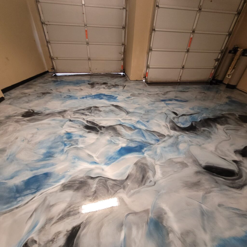
Deep Blue with Gray Accents: Professional, modern, popular Charcoal Gray: Sophisticated, hides dust, timeless Bright White: Showroom quality, clean, impressive Metallic Silver: Luxury feel, 3D effect, eye-catching
Residential Kitchens
Light Gray: Bright, clean, modern Cream: Warm, inviting, timeless Speckled Finish: Designer feel, visual interest Custom Beige-Gray: Matches design aesthetic
Commercial Retail
Bright White or Light Gray: Professional, clean impression Custom Colors: Brand-coordinated finishes Metallic: Luxury retail showrooms Safety Colors: Retail spaces with designated zones
Basements & Living Spaces
Light Colors: Brighten typically dark spaces Metallic: Create luxury basement environments Neutral Tones: Versatile for various furnishings Custom Colors: Match interior design
Warehouses & Commercial
Bright White or Light Gray: Increases visibility, safety Epoxy with Safety Stripes: Functional markings Custom Industrial Colors: Professional appearance
COLOR MISTAKES TO AVOID
Don’t make these choices.
Mistake 1: Choosing Trendy Colors
Trends fade. What’s trendy now may look dated in 3 years.
Better: Choose classic colors you genuinely love.
Mistake 2: Not Viewing Samples in Your Space
Color looks different in different lighting and surroundings.
Better: Always view samples in your actual space in different lighting.
Mistake 3: Choosing Based on Photos
Someone else’s space has different lighting and surroundings.
Better: See colors in person in your space.
Mistake 4: Ignoring Practical Factors
Some colors require more maintenance than others.
Better: Consider both aesthetics and practicality.
Mistake 5: Not Considering Resale
Bold colors appeal to specific tastes.
Better: Consider future buyers or choose custom with confidence.
FREQUENTLY ASKED QUESTIONS
Q: Can I change the color later?
A: Technically yes, but it’s expensive and time-consuming. Choose carefully the first time.
Q: Will my color fade over time?
A: Quality epoxy maintains color for 10+ years. Cheap epoxy yellows and fades.
Q: Can I mix two colors?
A: Yes. Custom color blending available. We can create unique two-tone combinations.
Q: What’s the most popular color?
A: Deep blue and charcoal gray are most popular. But personal preference is most important.
Q: Can I get metallic effects?
A: Yes. Metallic epoxy creates stunning 3D effects with swirling metallic patterns.
Q: Does color affect cost?
A: Standard colors are base price. Metallic and custom blends cost slightly more.
Ready to choose your perfect epoxy color?
SCHEDULE YOUR FREE COLOR CONSULTATION
We’ll bring color samples, show you options in your lighting, and help you choose a color you’ll love.
CALL 210-753-8986
Free Estimate
Want this floor in your space?
We measure, inspect the slab, and give you a real number — no obligation.


